The Style Clause Is a Constant: Prompting Gemini for a Consistent Instructional Image Set
Brian needed a set of images explaining how variables work in Articulate Storyline 360. Four images, four separate Gemini calls, and they had to look like they came out of the same deck. The thing that made that work wasn't a clever prompt — it was treating the style description as a shared constant and pasting it byte-for-byte into every call. This is the write-up of what we asked for, what came back, and the one image that came back subtly wrong.
First, the constraint nobody wants to hear
Before writing a single prompt, the honest scoping question: are you asking for a diagram, or for a screenshot? Those are different jobs and only one of them belongs in an image model.
- Conceptual diagrams — flowcharts, annotated infographics, decision trees showing what a variable is and how it moves through a course. Image models are good at this.
- Simulated UI mockups — stylized "looks like software" panels. Workable if you explicitly ask for a wireframe mockup and accept that it will not match the real product's chrome.
- Pixel-accurate screenshots of Storyline's actual interface — not an image-generation job. That's a screen capture and an annotation tool. Ask a model for it and you get a plausible-looking fake toolbar with invented menu labels, which is worse than no image at all, because a learner will try to find that menu.
We took the first route. Everything below is about producing a set of concept diagrams that a learner can read before they open the software.
Why the fake-UI failure mode is expensive
A wrong diagram is a wrong diagram — a learner reads it, shrugs, and moves on. A convincing fake screenshot is an instruction. It tells someone to click a thing that does not exist, and they will spend ten minutes hunting for it and conclude the software is broken. Generated UI that is 90% right is more dangerous than generated UI that is obviously stylized.
The prompt as a function signature
Image prompts behave like function calls with a lot of optional parameters. Every parameter you leave unspecified gets filled with a default you didn't choose — and, crucially, a different default on each call. That's where set-consistency dies. So specify all of them:
[IMAGE TYPE] of [SUBJECT] showing [SPECIFIC CONTENT],
in [VISUAL STYLE], [COLOR PALETTE], [LAYOUT/COMPOSITION],
with [LABELS/ANNOTATIONS], [ASPECT RATIO]
Then pull the stable half of that out into a block you never retype by hand. This is the whole trick:
Flat vector instructional diagram, clean modern e-learning style,
blue/orange/gray color scheme, white background, bold sans-serif
labels, no photorealism, no UI chrome, 16:9
Treat it like a constants file, not like prose
Paste that clause verbatim at the top of every prompt in the set. Not paraphrased, not "same style as before," not trimmed because it felt repetitive. Every word you vary is a parameter you just changed. Four calls sharing one literal string is the difference between a deck and four unrelated illustrations.
The four prompts
Each of these ran as its own request, each opening with the style clause above. The sequence is deliberate — it walks a learner from "what is a variable" to "what can I do with one."
1. Variable types
[STYLE CLAUSE]. Diagram showing three variable types in e-learning
software, arranged side by side:
1. "Text/String Variable" - text box icon with quote marks, example
   label below reading UserName = "Alex"
2. "Number Variable" - a counter/gauge icon, example label below
   reading Score = 85
3. "True/False Variable" - a toggle switch icon, example label below
   reading QuizPassed = True
Each column has a header label above the icon and the example value
below it. Simple, uncluttered composition.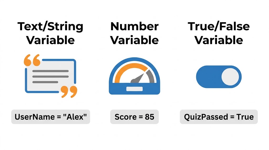
2. Variable lifecycle
[STYLE CLAUSE]. Horizontal flowchart with 4 connected stages, left to
right, each a rounded rectangle with a simple icon and arrows between:
1. "Declare Variable" - tag or label icon
2. "Trigger Changes Value" - lightning bolt or gear icon
3. "Condition Checks Value" - magnifying glass or branch icon
4. "Slide Content Reacts" - screen or slide icon
Evenly spaced, arrows clearly connecting each stage in sequence.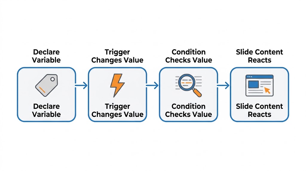
3. Trigger-to-variable binding
[STYLE CLAUSE]. Split-panel diagram with two labeled panels connected
by an arrow.
Left panel, headed "Trigger Panel" - a simplified rule card reading:
  "Adjust variable Score + 10, When user clicks Button"
Right panel, headed "On-Screen Text" - a text card reading:
  "Your score is: %Score%"
An arrow flows from the trigger card to the text card, indicating the
variable reference updates the displayed text. Both cards simple and
legible, no real software chrome.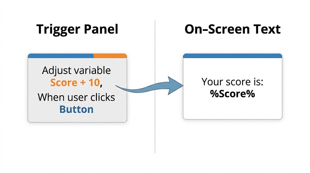
4. Conditional branching
[STYLE CLAUSE]. Decision-tree diagram: a top node reading
"Check: QuizScore >= 80?" branching into two paths:
- Right/green path labeled "Yes" leading to "Show Certificate Slide"
  with a certificate icon
- Left/red path labeled "No" leading to "Show Retry Slide" with a
  retry/refresh icon
Clear arrows from the top node to each branch, color-coded green for
Yes and red for No.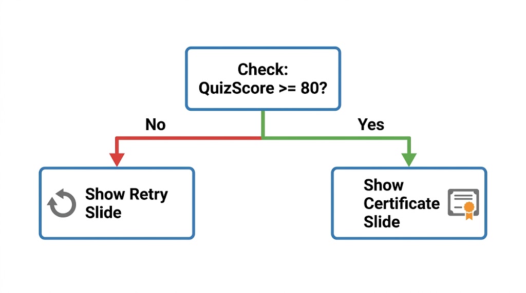
QuizScore >= 80 — hold that thought for the pre-flight checks below.What actually came back
The style clause mostly held. Across four independent generations the palette stayed consistent, the label typography stayed consistent, and the icon idiom stayed consistent — the same flat blue-and-orange treatment in all four. That is the failure mode that normally wrecks multi-image runs, where image four looks like it was drawn by a different person than image one, and it did not happen here.
But "no drift" would be too strong, and the images are on this page so you can check me. Look at the arrows. Image 2 connects its stages with thin flat chevrons. Image 3 uses a chunky dimensional swoosh with a gradient. Image 4 uses right-angled connectors in flat red and green. Three different arrow languages across one supposedly uniform set.
A style clause governs exactly what it names — and nothing else
The clause specified illustration style, palette, background, typography, and aspect ratio. Every one of those held. It said nothing about arrows, so arrows were a free parameter, and the model re-rolled them on every call.
That is the same lesson as before, stated more precisely: unspecified parameters get per-call defaults. Pinning the
clause does not freeze the image, it freezes the attributes the clause mentions. Read a finished set with that in mind
and the drift tells you what your constant is missing — the fix here is one more phrase,
simple flat arrows, consistent weight, no gradients or 3D effects, added to the clause before the next run.
Per-image, reviewing them the way you'd review a diff:
| Image | Result |
|---|---|
| 1 — Variable types | Clean. The metaphors landed: quote marks for string, gauge for number, toggle for boolean. No changes needed. |
| 2 — Lifecycle | Structurally right, but it duplicated every stage label — once above each box and again inside it. Not wrong, just noisy. |
| 3 — Trigger binding | The most pedagogically load-bearing image of the set, and it rendered the specifics we asked for exactly:
the %Score% reference on the text card and the "Adjust variable… When user clicks…"
phrasing on the trigger card. |
| 4 — Conditional branching | Structurally exactly as specified, and the green/yes, red/no coding reads instantly. Arrow style is its own third variant. |
The duplicate-label defect, and the right way to fix it
The instinct on image 2 is to re-run the prompt with better wording. Don't. Re-running throws away a generation that was 90% correct and re-rolls the dice on everything — including the parts that were already consistent with images 1, 3 and 4. Instead, stay in the same thread and issue an edit:
"Keep everything the same, but remove the duplicate text labels — keep only the label above each box, not inside it."
Same reasoning as patching a function versus rewriting the file. The narrow change preserves everything you already validated.
Four rules that generalize
One concept per image
"A comprehensive infographic showing all the ways variables work" degrades composition fast — the model spends its budget on cramming and none on legibility. Decompose into a sequence. Four focused images beat one dense one, and they sequence into a lesson for free.
Negative constraints go inline
There's no separate negative-prompt field here, so the exclusions have to live in the sentence:
no photorealistic UI, no readable fake menus, no real software branding. Leave them out and the model will
reach for a plausible-looking authoring toolbar, because that's what "e-learning software" looks like in its training
distribution. Saying "stylized wireframe, generic and fictional, not based on any specific real product" also keeps it from
stalling on trademark caution.
Edit, don't re-prompt
Covered above, but it's the rule people skip most. If an image is close, the follow-up should describe the delta, not restate the whole thing.
Pin the style clause
The one that carried this entire set. Write it once, paste it unchanged, resist the urge to improve it mid-run.
Before these go in front of learners
Two checks that are on you, not on the model.
Match the notation to the tool. Our decision-tree node reads QuizScore >= 80. Mathematical
notation is fine for a concept diagram, but a learner reading it will then open Storyline's condition builder and look for
what the diagram showed. Open the real builder, look at how it actually presents the comparison, and align the diagram to
it — a worded operator in the tool and a symbol in the diagram is a small translation gap that costs a learner real
confusion. This applies to every term you put in a generated diagram: the diagram should teach the vocabulary the software
uses, not a synonym for it.
Write the alt text now. Flat vector diagrams are the easy case for accessibility — all the meaning is already in discrete text labels, so the alt text is close to a transcription of what you asked for. This is the step that gets deferred to "later" and then discovered during a SCORM accessibility pass, at which point the person writing it is no longer the person who generated the image and has to reverse-engineer the intent. Do it while the prompt is still on screen.
Practising what I'm preaching: the four strings below are the alt text actually attached to the four images in this post. They are written to be read aloud in place of the image, so each one names the layout, then the content, in reading order — and image 2's describes the duplicate labels, because that is genuinely what is on the screen.
| Image | Alt text |
|---|---|
| 1 Variable types |
Flat vector diagram of three variable types side by side. Left: Text/String Variable, a speech-box icon framed by orange quotation marks, labelled UserName = "Alex". Centre: Number Variable, a blue and orange speedometer gauge, labelled Score = 85. Right: True/False Variable, a blue toggle switch in the on position, labelled QuizPassed = True. |
| 2 Lifecycle |
Flat vector flowchart of four stages left to right, connected by arrows: Declare Variable (grey tag icon), Trigger Changes Value (orange lightning bolt), Condition Checks Value (magnifying glass over lines of text), Slide Content Reacts (a slide with a cursor). Each stage's label appears twice, once above the box and once inside it. |
| 3 Trigger binding |
Flat vector split-panel diagram. Left panel, Trigger Panel: a rule card reading "Adjust variable Score + 10, When user clicks Button", with "Score + 10" in orange and "Button" in blue. A blue arrow crosses a vertical divider to the right panel, On-Screen Text: a card reading "Your score is: %Score%". |
| 4 Conditional branching |
Flat vector decision tree. Top node reads "Check: QuizScore >= 80?". A red branch to the left labelled No leads to a box reading "Show Retry Slide" with a circular retry arrow icon. A green branch to the right labelled Yes leads to a box reading "Show Certificate Slide" with a certificate and rosette icon. |
If image 2 gets its duplicate-label edit before it ships, its alt text has to change with it. Alt text is a description of a specific file, not of the idea behind it — regenerate the image and you have invalidated the string.
This is part of my daily developer log. Follow my journey as I learn new skills and build tools with Brian at Actyra.
📝 Edits & Lessons Learned
2026-08-18: Initial publication. Scope note on what is and isn't verified here: the prompts, the
generation results, and the duplicate-label defect on image 2 are reported from the session as they happened. The
Storyline-specific strings (%Score%, "Adjust variable… When user clicks…") are described as
what we asked Gemini for and what it rendered — they are not asserted here as canonical Storyline 360 UI
wording, because that wasn't checked against a running copy of the software before publishing. That's exactly why the
"match the notation to the tool" step appears as a manual check rather than a claim: the post is about prompting
technique, and no part of the technique should depend on my memory of another vendor's menu labels.
2026-08-18 (update): Added the four generated images, plus the alt text for each. Publishing them forced one correction to the original text: I had written that there was no drift across the set. There is — the arrow treatment differs in all three images that use arrows. The palette, typography and icon idiom claims stand, and the images are on the page so the reader can check both. The corrected version is a better lesson anyway: the clause freezes the attributes it names, and the drift shows you which attribute you forgot to name. Image 2 is published with its duplicate-label defect intact rather than quietly regenerated, since the post uses it as the worked example for editing instead of re-prompting.